


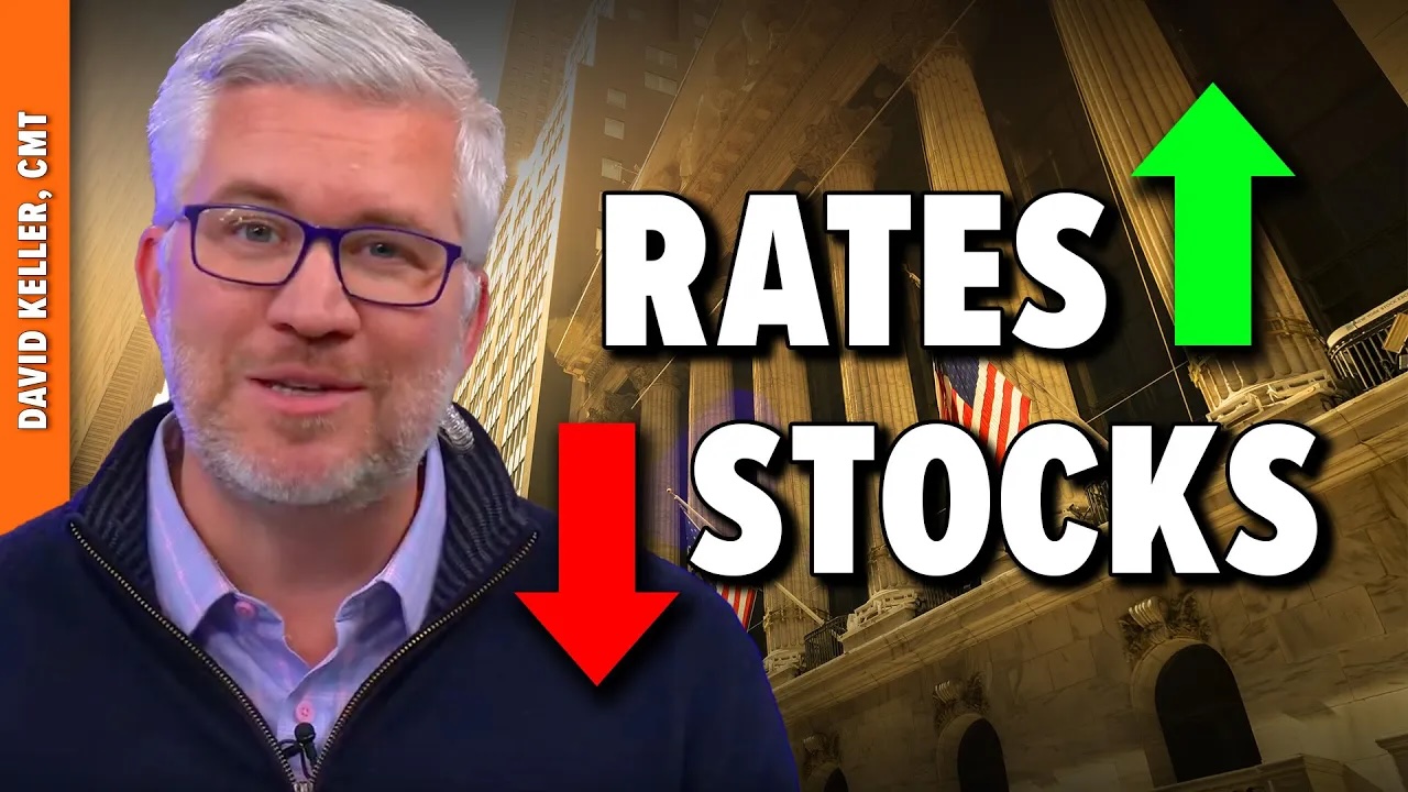
In this video, Dave shares a long-term analysis of the Ten-Year Treasury Yield, breaks down how the shape of the yield curve has been a great leading indicator of recessionary periods and weaker stock prices, and outlines the chart he’s watching to determine if early 2025 will look a great deal like early 2022.
This video originally premiered on January 6, 2025. Watch on StockCharts’ dedicated David Keller page!
Previously recorded videos from Dave are available at this link.